Google Simplifies the Search Interface
 Friday, November 9, 2012 at 09:50AM
 Google Simplifies the Search Interface
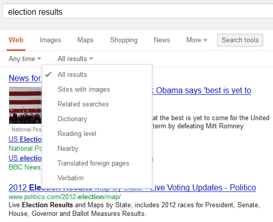
After a few months of testing, Google released a new search interface that removes the left sidebar and replaces it with a much simpler horizontal bar placed below the search box. A similar UI was launched last year for tablets and last month for smartphones, so Google tries to offer a consistent user experience.

While the old features are still available, the advanced search tools are no longer displayed by default. You need to click "search tools" and pick the right option. Google used to display some relevant search tools and the old interface made it easier to find recent results. Now you need 3 clicks to find results from the past 24 hours instead of only one click (sometimes two clicks). Another issue is that it's much easier to accidentally click the ads when you're using the search tools.


"With the new design, there's a bit more breathing room, and more focus on the answers you're looking for, whether from web results or from a feature like the Knowledge Graph. It's going out to Google.com users in the U.S. to start, and we want to get it to users in other languages and regions as soon as we can," informs Google.

 Miguel M. de la O | Comments Off |